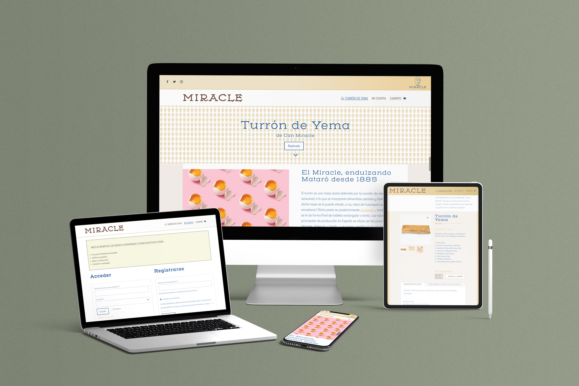
Miracle. A sweet heritage
In 2013, Miracle pâtisserie, or “Can Miracle” closed in Mataró after 128 years, it was famous in the city for its involvement in traditional festivals and its burnt crème nougat.
His heirs have decided to regain the brand step by step, doing things right, preserving the heritage with personality, but updating it to our times.
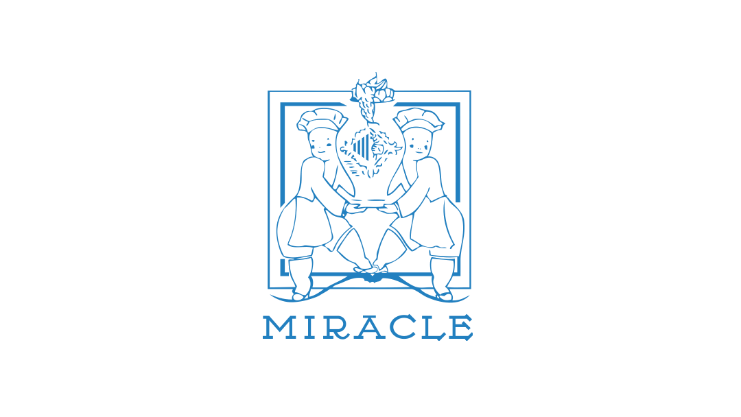
I started this project by studying and preserving the symbol, an essential identity element of the brand. The character appeared in all stationary in previous decades but could not behave in the desired way in small or digital scenarios.
My strategic proposal redefines some of its elements and lightens its shapes to turn it into a flexible symbol.
I chose the Henderson Slab font from Ale Paul. They are not the same but fits well with the handmade logotype, both are geometrical slabs, and both remind old industrial times in the same way; it has an extended family of weights where they can play in a display mode.

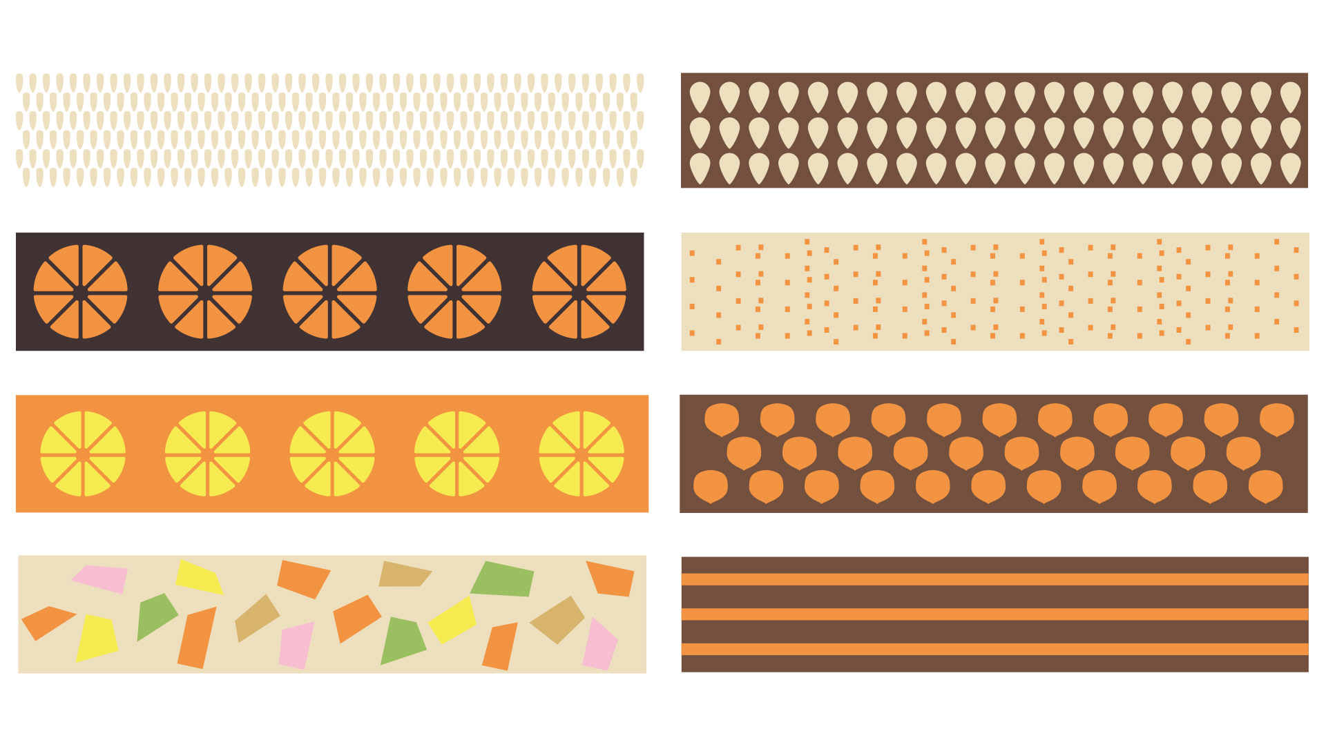
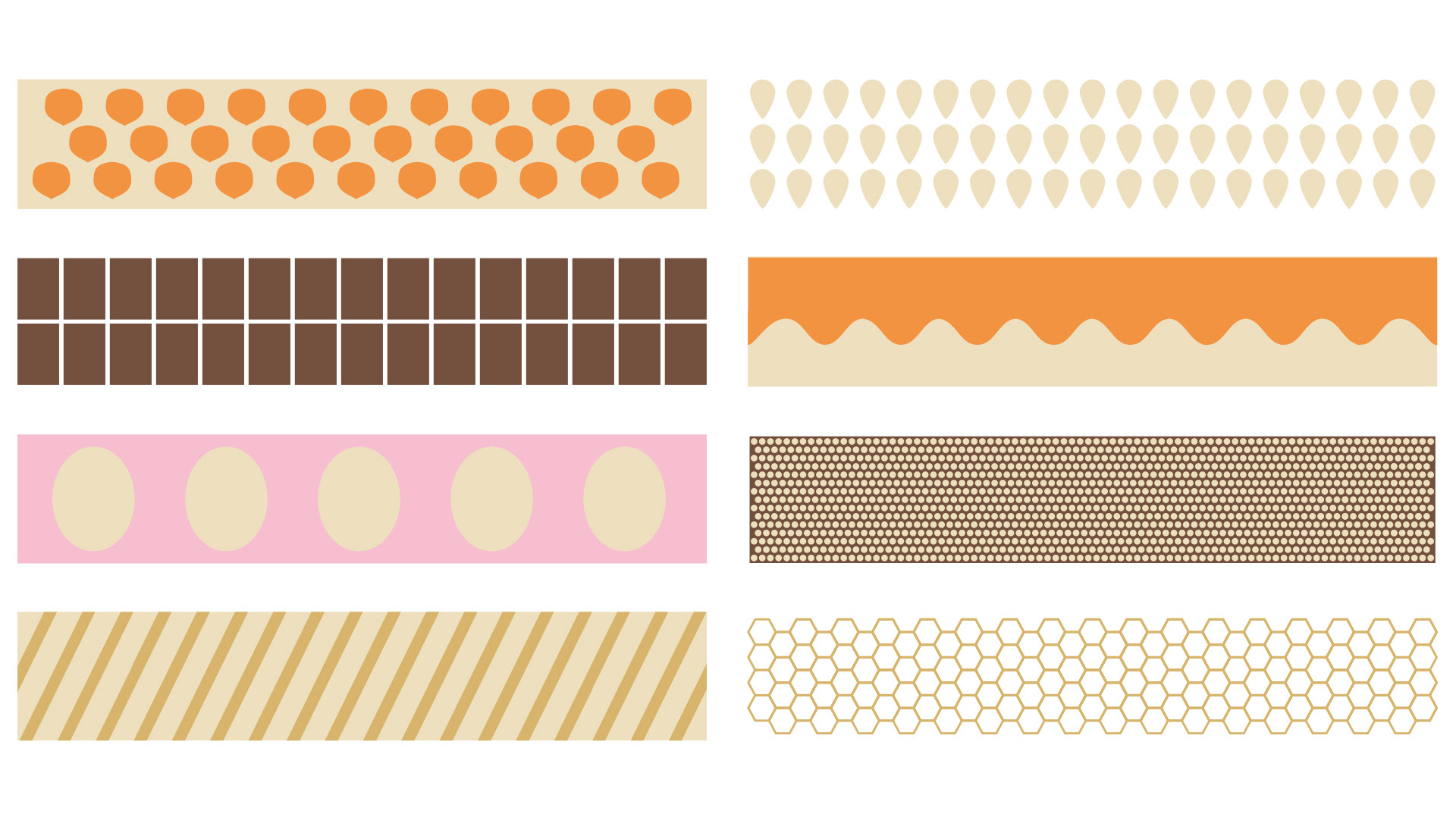
Evolving our visual language, I chose a range of colors related to confectionery. The colors cream, coffee, cinnamon, and orange combine well for their tertiary status because, with a fair synthesis, they can form geometric patterns that arouse appetite. So they with their forms are not ornaments but components that speak of the product itself.